
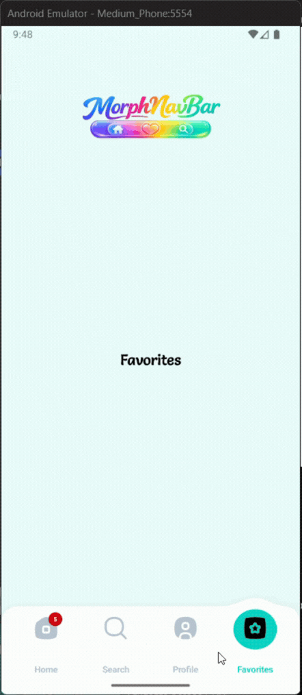
A beautiful, lightweight, fully customizable animated navigation bar with morphing bubble selection, badges, labels, and smooth tab transitions.
MorphNavBar is a modern Android custom bottom navigation component built for stylish apps that need fluid motion, smooth tab switching, badges, and full XML / Java customization.
- Morphing Bar — The bar’s top edge morphs with a cubic Bézier bump above the active tab.
- Elastic Bubble — The selection bubble stretches up to 2.4× horizontally and compresses vertically while moving.
- Proximity Fade — Inactive icons fade near the bubble and return after it passes.
- Damped Shake — Each tap triggers a 7.8 Hz damped shake for 760 ms on the previous tab.
- Badge Tracking — Badges follow their icon during transition and move with the active state.
- Label Blending — Label colors smoothly blend between inactive and selected states by bubble proximity.
In your root settings.gradle (or settings.gradle.kts):
dependencyResolutionManagement {
		repositoriesMode.set(RepositoriesMode.FAIL_ON_PROJECT_REPOS)
		repositories {
			mavenCentral()
			maven { url 'https://jitpack.io' }
		}
}dependencies {
implementation 'com.github.Melikash98:MorphNavBar:v2.2.9'
}<com.melikash98.morphnavbar.MorphNavBar
android:id="@+id/morphNavBar"
android:layout_width="match_parent"
android:layout_height="wrap_content"
<!-- Colors -->
app:lbv_barColor="@android:color/white" <!-- Main bar background color -->
app:lbv_shadowColor="#22000000" <!-- Bar shadow color -->
app:lbv_selectedColor="#00CFC0" <!-- Active bubble color -->
app:lbv_unselectedColor="#00CFC0" <!-- Stored unselected accent color -->
app:lbv_activeIconColor="@android:color/white" <!-- Selected tab icon tint -->
app:lbv_inactiveIconColor="#00CFC0" <!-- Inactive tab icon tint -->
<!-- Dimensions -->
app:lbv_barRadius="26dp" <!-- Corner radius of the bar -->
app:lbv_barHeight="100dp" <!-- Total height of the navigation bar -->
app:lbv_barSideMargin="0dp" <!-- Left and right outer margin -->
app:lbv_barBottomMargin="0dp" <!-- Bottom margin of the bar -->
app:lbv_itemIconSize="34dp" <!-- Size of each tab icon -->
app:lbv_shadowBlur="12dp" <!-- Shadow blur radius -->
app:lbv_shadowDy="4dp" <!-- Shadow vertical offset -->
<!-- Animation -->
app:lbv_animationDuration="1400" <!-- Selection animation duration in ms -->
<!-- Labels -->
app:lbv_showLabels="true" <!-- Show labels below tabs -->
app:lbv_showLabelOnlyOnSelected="false" <!-- Show label only for selected tab -->
app:lbv_labelTextSize="14sp" <!-- Label text size -->
app:lbv_labelFontFamily="sans-serif" <!-- Label typeface family -->
<!-- Badges -->
app:lbv_badgeBackgroundColor="@android:color/holo_red_light" <!-- Badge background color -->
app:lbv_badgeTextColor="@android:color/white" <!-- Badge text color -->
app:lbv_badgeTextSize="11sp" <!-- Badge text size -->
/>Define tabs Each tab is a MorphNavTabItem.Model. You can optionally provide a separate drawable for the active (inside-bubble) state: MorphNavBar navBar = findViewById(R.id.morphNavBar);
// Varargs — set all tabs at once
navBar.setTabs(
    new MorphNavTabItem.Model("Home",    R.drawable.ic_home,    R.drawable.ic_home_filled),
    new MorphNavTabItem.Model("Search",  R.drawable.ic_search,  R.drawable.ic_search_filled),
    new MorphNavTabItem.Model("Inbox",   R.drawable.ic_inbox,   R.drawable.ic_inbox_filled),
    new MorphNavTabItem.Model("Profile", R.drawable.ic_profile, R.drawable.ic_profile_filled)
);
Or add tabs incrementally:
navBar.setSelectedIndex(2);           // animated morph transition
navBar.setSelectedIndex(2, false);    // instant jump without animation
navBar.show(0);                       // alias for setSelectedIndex(0)

int current = navBar.getSelectedIndex();
int total   = navBar.getItemCount();
Navigate programmatically
navBar.setSelectedIndex(2);           // animated morph transition
navBar.setSelectedIndex(2, false);    // instant jump without animation
navBar.show(0);                       // alias for setSelectedIndex(0)

int current = navBar.getSelectedIndex();
int total   = navBar.getItemCount();
Badge counts
navBar.setCount(1, "5");     // string badge on tab at index 1
navBar.setCount(2, 99);      // numeric badge on tab at index 2
navBar.clearCount(1);        // remove badge from tab 1
navBar.clearAllCounts();     // remove all badges
Badges automatically track their icon during the morph animation — they follow the bubble from inactiveIconY to activeIconY at the transition midpoint.
val navBar = findViewById<MorphNavBar>(R.id.morphNavBar)

navBar.setTabs(
    MorphNavTabItem.Model("Home",    R.drawable.ic_home,    R.drawable.ic_home_filled),
    MorphNavTabItem.Model("Search",  R.drawable.ic_search,  R.drawable.ic_search_filled),
    MorphNavTabItem.Model("Profile", R.drawable.ic_profile, R.drawable.ic_profile_filled)
)

navBar.setOnTabSelectedListener { index, item ->
    // called after the morph animation completes
}

navBar.setCount(0, "3")
navBar.setSelectedIndex(1)MorphNavBar exposes four distinct interfaces to cover every interaction scenario:
// Fires once, after the bubble animation fully settles on the new tab
navBar.setOnTabSelectedListener((index, item) -> {
    // safe place to switch fragments
});

// Fires immediately on every tap — before animation starts, selected or not
navBar.setOnClickMenuListener(item -> {
    // good for analytics or haptic feedback
});

// Fires when the user taps the tab that is already selected
// The library also automatically triggers a shake animation on that tab
navBar.setOnReselectListener(item -> {
    // e.g. scroll RecyclerView to top
});

// Fires on initialization (after setTabs) and on every subsequent selection,
// including programmatic calls to setSelectedIndex() or show()
navBar.setOnShowListener(item -> {
    // good for tracking screen visibility
});
MorphNavTabItem.Model
// Minimal — same drawable for active and inactive state
new MorphNavTabItem.Model("Label", R.drawable.ic_icon);

// With a distinct selected drawable (rendered inside the bubble, tinted with activeIconColor)
new MorphNavTabItem.Model("Label", R.drawable.ic_icon, R.drawable.ic_icon_filled);

// With accessibility content description
new MorphNavTabItem.Model("Label", R.drawable.ic_icon, R.drawable.ic_icon_filled, "Home tab");
When selectedIconResId is 0, the library falls back to iconResId for the active state.
| Attribute | Type | Description |
|---|---|---|
lbv_barColor |
color | Background color of the navigation bar |
lbv_shadowColor |
color | Shadow color behind the bar |
lbv_selectedColor |
color | Color of the morphing bubble |
lbv_unselectedColor |
color | Stored accent color for unselected state |
lbv_activeIconColor |
color | Tint color for the active icon |
lbv_inactiveIconColor |
color | Tint color for inactive icons |
lbv_barRadius |
dimension | Corner radius of the bar |
lbv_barHeight |
dimension | Total height of the bar |
lbv_barSideMargin |
dimension | Left and right outer margin of the bar |
lbv_barBottomMargin |
dimension | Bottom margin of the bar |
lbv_itemIconSize |
dimension | Size of each tab icon |
lbv_shadowBlur |
dimension | Blur radius of the bar shadow |
lbv_shadowDy |
dimension | Vertical shadow offset |
lbv_animationDuration |
integer | Duration of tab transition animation in milliseconds |
lbv_showLabels |
boolean | Enables label rendering under tabs |
lbv_labelTextSize |
dimension | Label text size |
lbv_labelFontFamily |
string | Font family used for labels |
lbv_showLabelOnlyOnSelected |
boolean | Shows label only for the selected tab |
lbv_badgeBackgroundColor |
color | Badge background color |
lbv_badgeTextColor |
color | Badge text color |
lbv_badgeTextSize |
dimension | Badge text size |
This project is licensed under the MIT License. See LICENSE for details.
ndroid bottom navigation bar, morphing bubble navbar, elastic stretch animation android, canvas custom view android, damped shake animation, animated tab bar android, physics navigation bar android
If you find MorphNavBar useful, please consider giving it a ⭐ star on GitHub — it helps the project grow and motivates further development.
For feature requests, improvements, bug reports, or similar suggestions, please send me a message or open an issue. Your feedback is highly appreciated.