This AutoComplete React component enhances user input experience by providing real-time suggestions as the user types. It is minimalist, highly customizable and easy to integrate into your React projects.
- 🔄 Dynamic Filtering: Filters options based on user input.
- ✨ Customizable Styles: Supports BEM methodology for easy styling.
- 🔒 Option Restriction: Option to restrict input to the provided options.
- 🔄 Updatable: Responds to changes with an
onChangehandler.
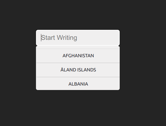
npm install autocomplete-react-minimalistimport Autocomplete from "autocomplete-react-minimalist";
const options = [
{ label: "Afghanistan", key: "AF" },
{ label: "Åland Islands", key: "AX" },
{ label: "Albania", key: "AL" },
{ label: "Algeria", key: "DZ" },
{ label: "American Samoa", key: "AS" },
{ label: "Andorra", key: "AD" },
];
const MyComponent = () => {
return (
<Autocomplete
inputKey="my-autocomplete"
placeholder="Type to search..."
listToFilter={options}
modifierClass=""
isRestrictedToOption={true}
onChange={(value) => console.log(value)}
notFoundMessage="No results found."
/>
);
};
- 🆔
inputKey(string): Unique key for the input element. - 💬
placeholder(string): Placeholder text for the input field. - 📋
listToFilter(array): Array of objects withkeyandlabelto filter. Inside sample you can find a json example. - 🎨
modifierClass(string): Custom CSS class for styling. - 🚀
initValue(string): Initial value of the input. - 🔒
isRestrictedToOption(boolean): Restricts input to the provided options. - 🔄
onChange(function): Callback function for input change. Receives the key and value for the selected option. - 🔄
notFoundMessage(string): If this is defined, It'll show this message when no options are found instead of closing the dropdown.
Use BEM conventions for custom styling. We're working to support tailwind.
| Component | Class |
|---|---|
| Input | autocomplete__input |
| List Container | autocomplete__search |
| List Item (option) | autocomplete__search-item |
Feel free to open an issue or submit a pull request. We're open to suggestions and improvements. Before any contribution, please format the code as the project with npm run format.